10 Basic Rules for a pull together look in any room of your home
There are so many ways to fill a room but where do you start? I’ve complied 10 simple tips to help you pull together any room whether its filled with furniture or not. These tips will help determine where to put things, where not to put things and help you decided what is important and what’s not.
1. Think about the the function of the room and how are you using the space
Ask yourself how do I want to use the room and how many people will use it? That will help you decide the type of furnishings you’ll need and the amount of seating that will be best fit your needs.
2. What will your focal point be in the room
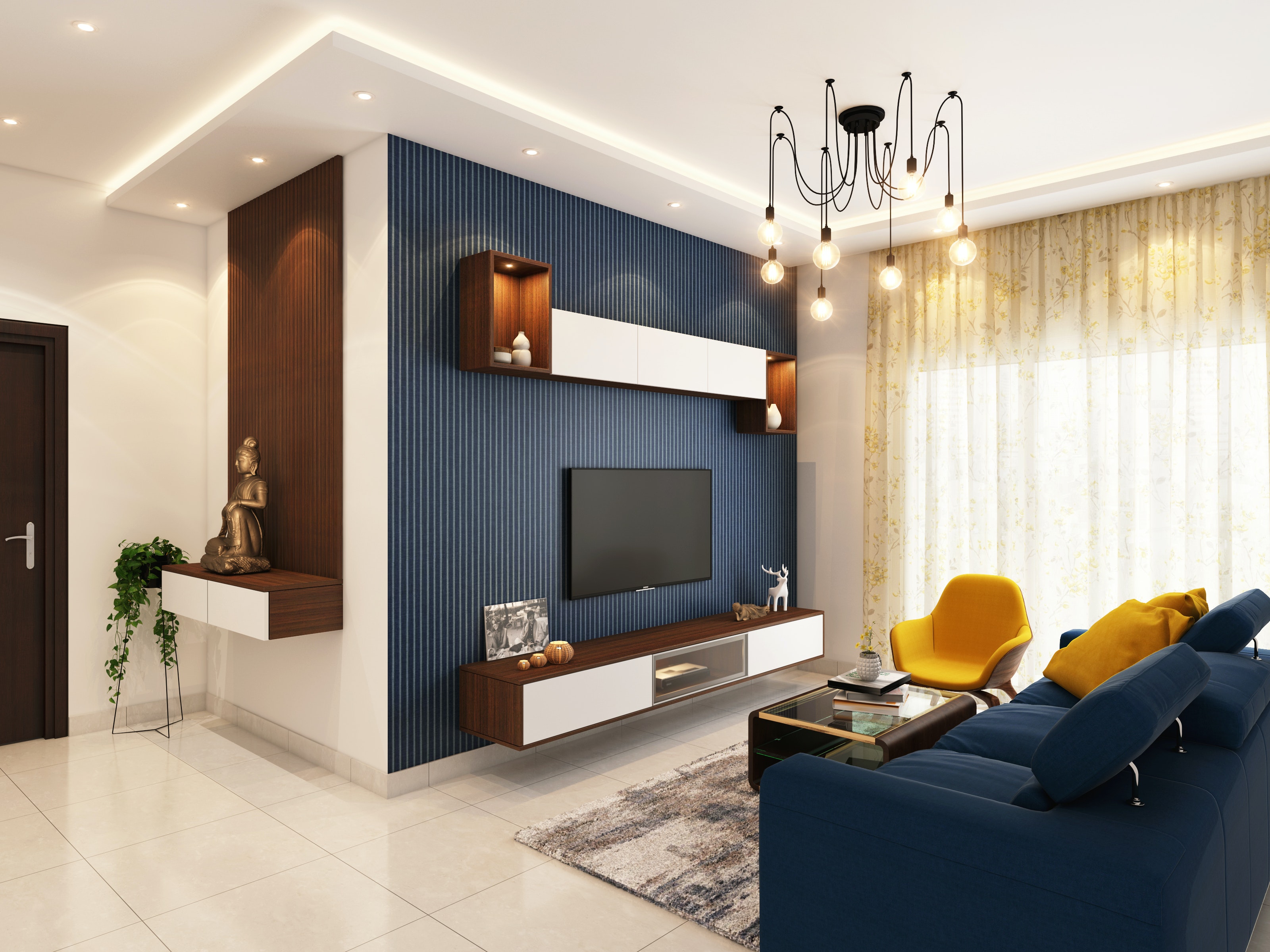
Decide what your focal point will be in the room, fire place, the television or even the view. If you plan to watch television in the room, the recommended distance between the set and the seating is three times the size of the screen (measured diagonally). Therefore, if you’ve got a 40-inch set, your chair should be 120 inches away.
3. Start with priority pieces
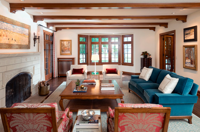
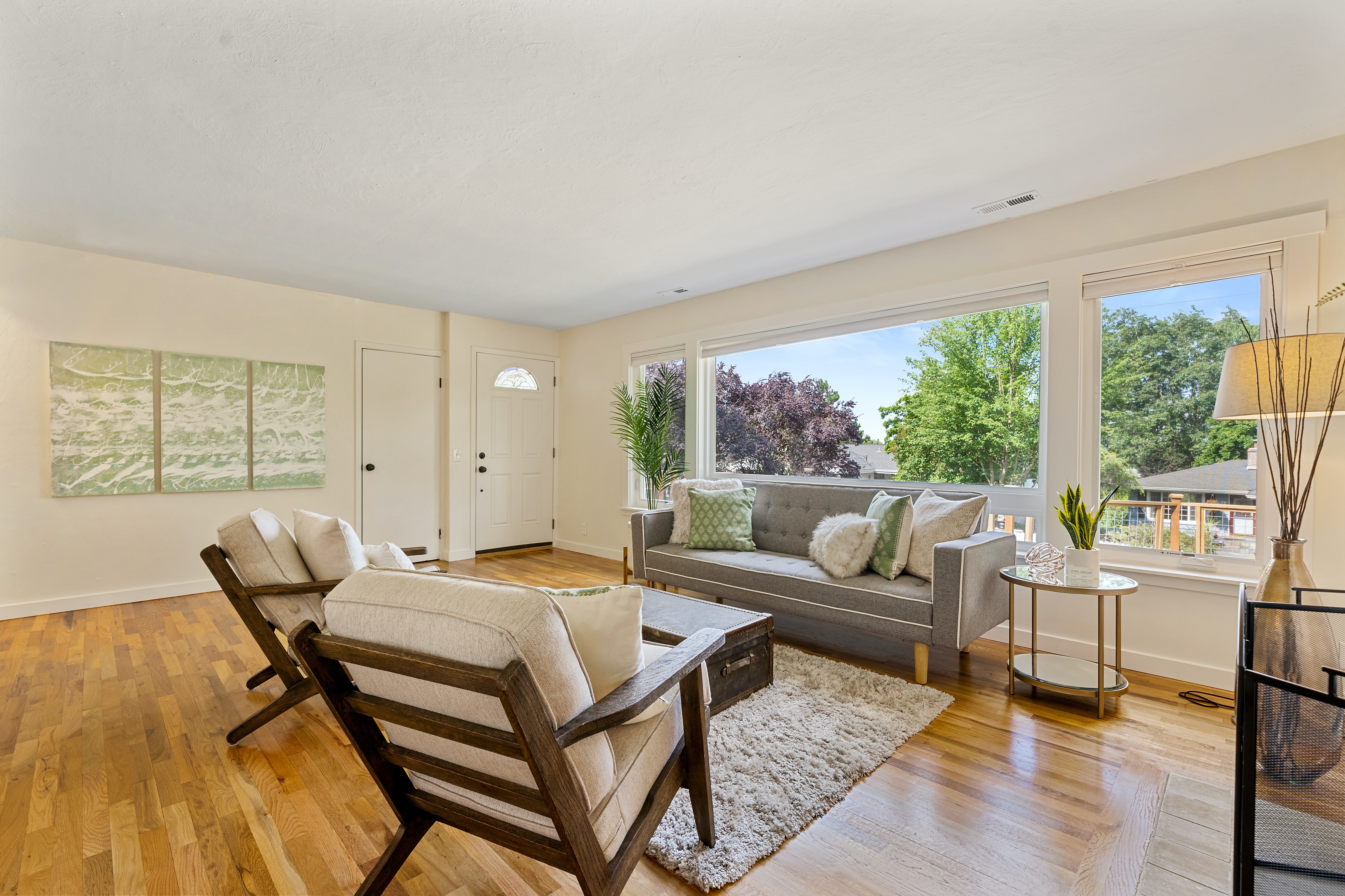
The largest pieces of furniture should go first, such as the sofa in the living room or the bed in the bedroom. You want these pieces to face the focal point. The recommended space between chairs are 8 feet apart to facilitate conversation. Of course if your room is small avoid pushing furniture against the walls.
4. Give some thought to Symmetry
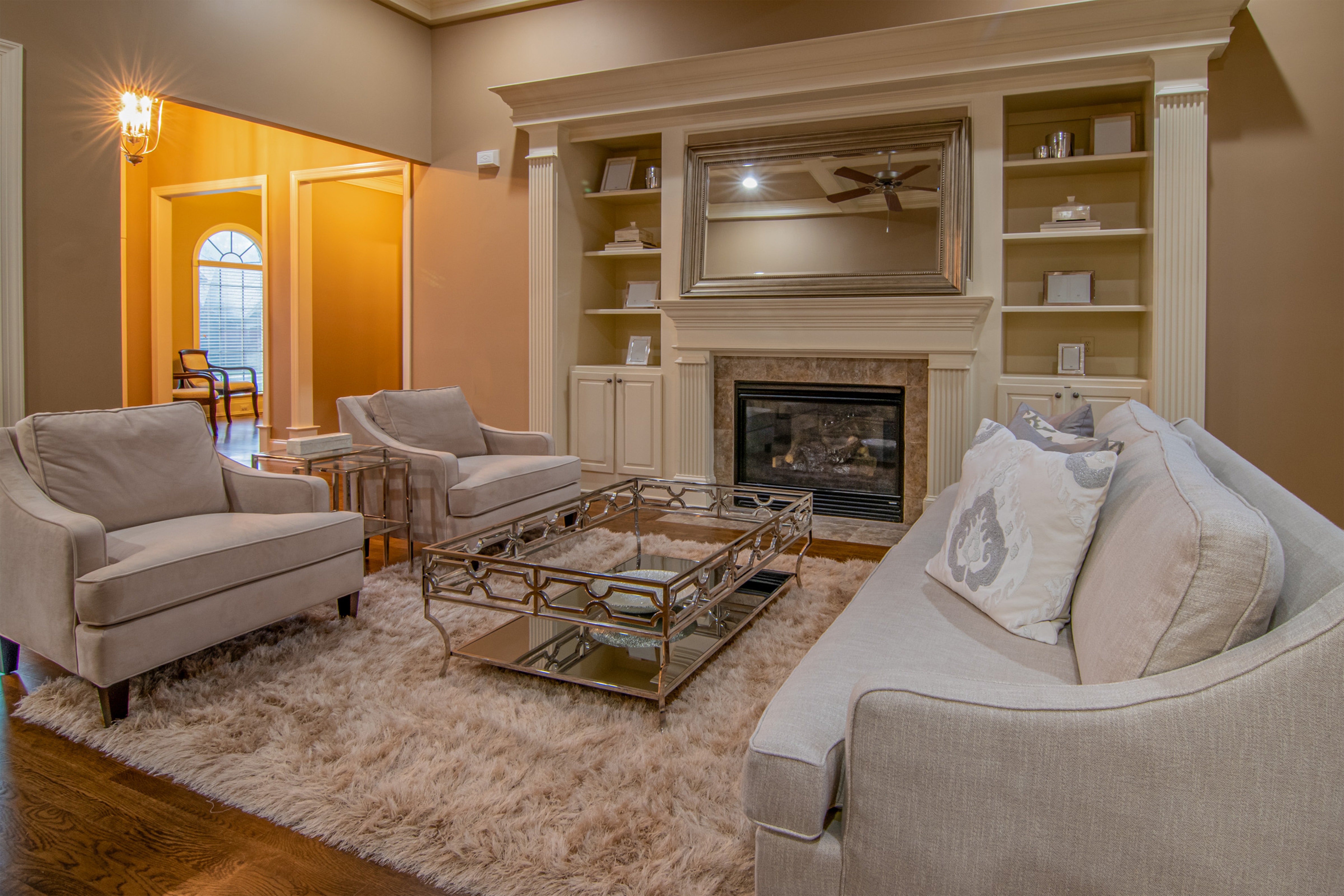
Symmetrical arrangements work best for formal rooms and asymmetrical arrangements make a room feel more casual. I think this is a super helpful tip because you will know right away what you prefer your space to feel and look like. Do you want casual or do you want a more formal feel? These are the questions I would ask myself.
5. Create a Traffic Flow
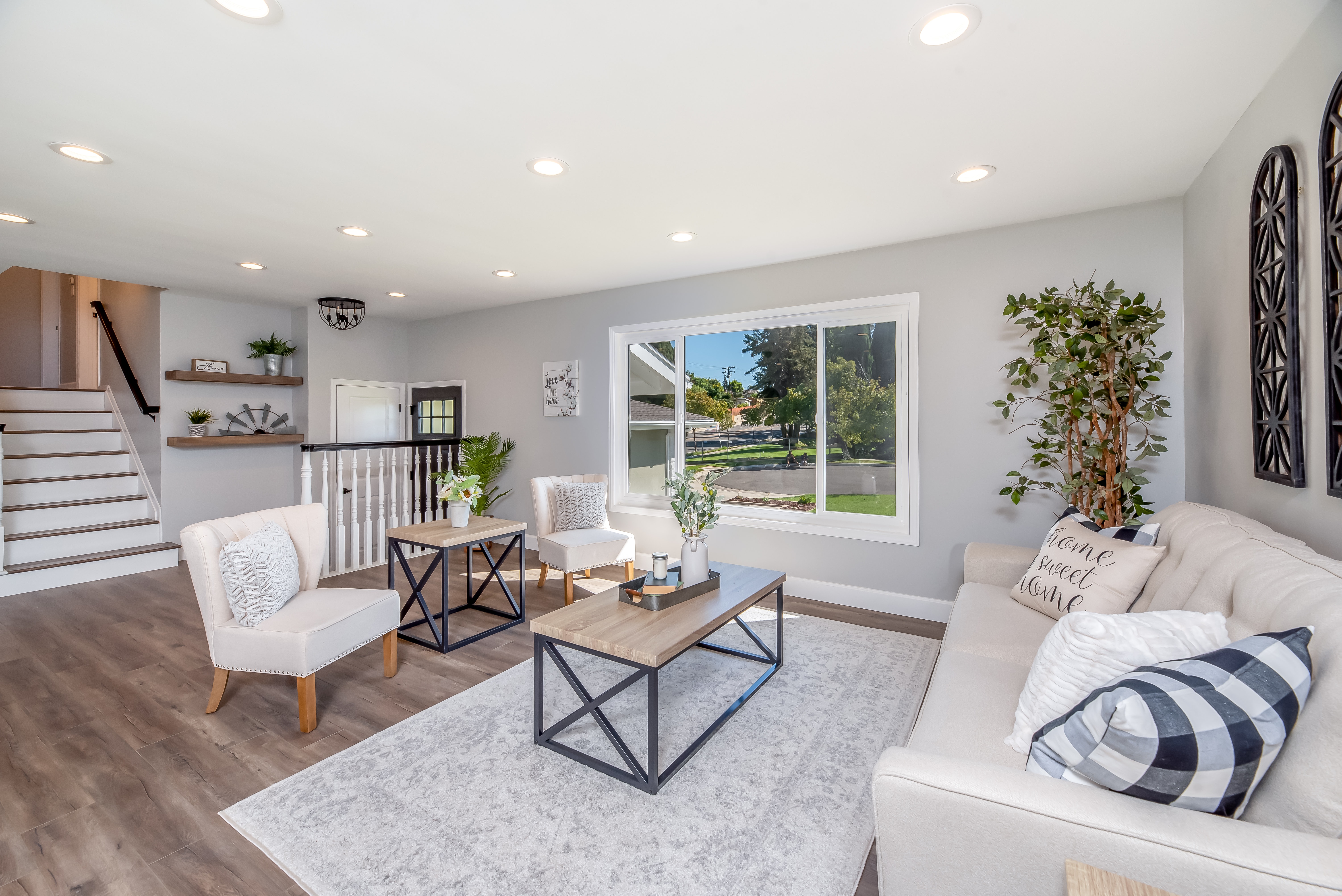
The flow of traffic through the room generally is the path between doorways. You don’t want to block that path with any large pieces of furniture if you can avoid it. The general rule is to allow 30 to 48 inches of width for major traffic routes and a minimum of 24 inches of width for minor ones.
I would direct traffic around a seating group, not through the middle of it. Or you can create two small seating areas instead of one large one.
6. Variety
You can vary the size of furniture pieces throughout the room, this is so your eyes move up and down as you scan the space and avoid putting two tall pieces next to each other. Also, balance a large or tall item by placing another piece of similar height across the room from it.
7. Build in Contrast
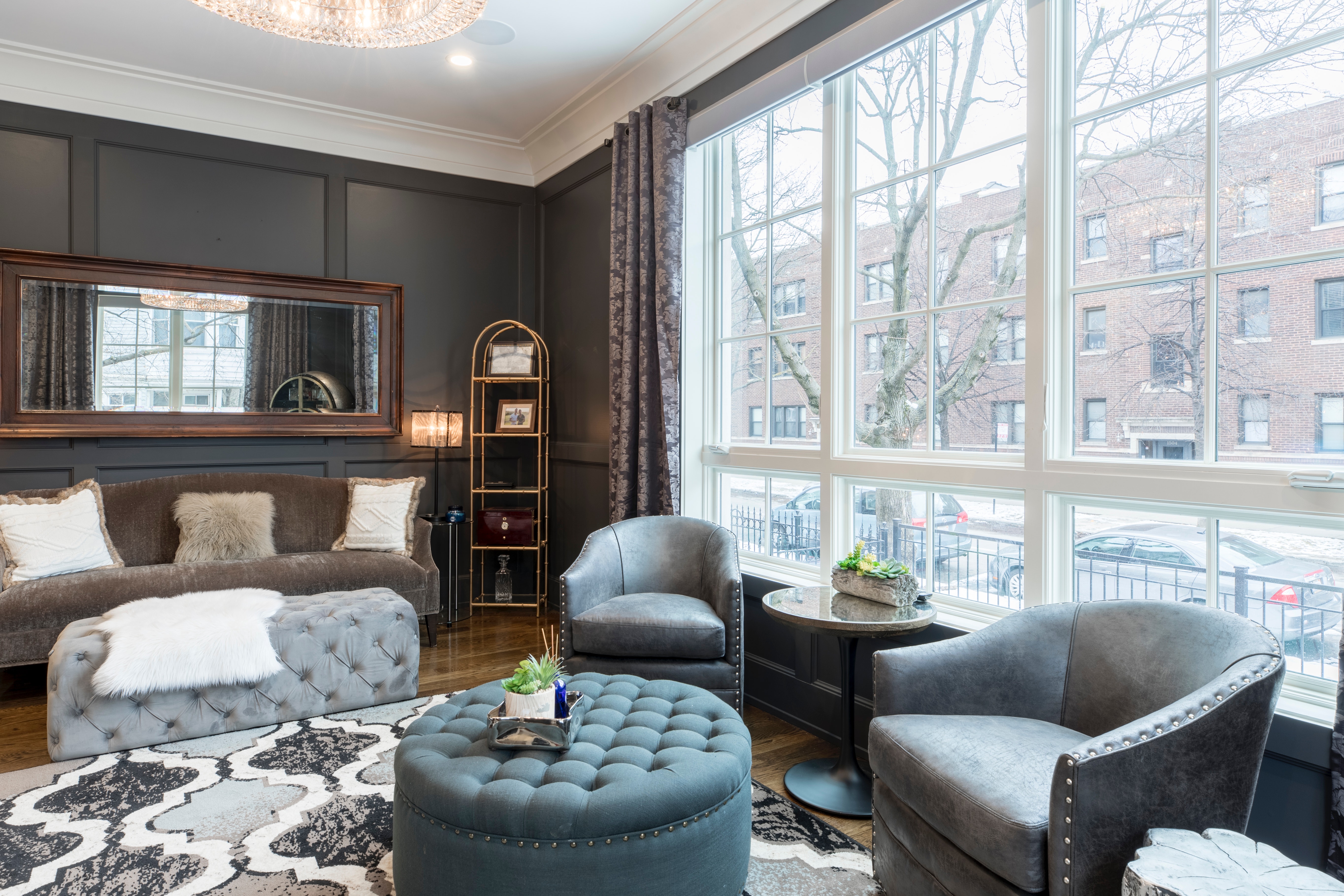
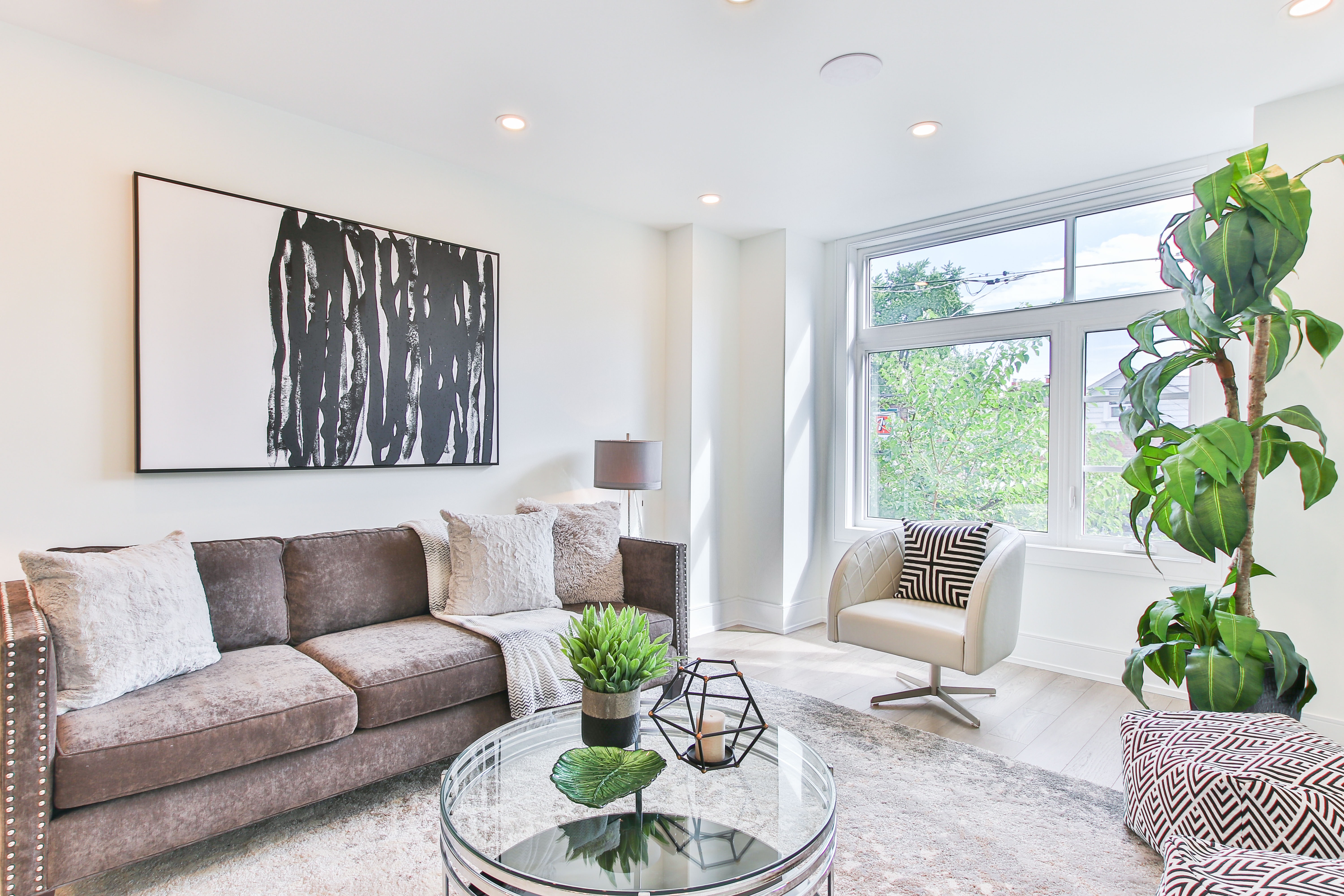
Combining straight and curved lines to add contrast can make a huge difference. I really love the idea of straight lines with curvy lines. If the furniture is modern and linear, throw in a round table. If the furniture is curvy, mix in an angular piece. You can also combine a leggy chair with a solid side table, and a solid chair with a leggy table.
8. Design for Easy Accessibility
Place a table within easy reach of every seat and make sure every reading chair has an accompanying lamp. Also, coffee tables should be located 14 to 18 inches from a sofa to provide legroom. I personally think you can adjust this one because sometimes you just do not have the space.
9. Allow for Flow
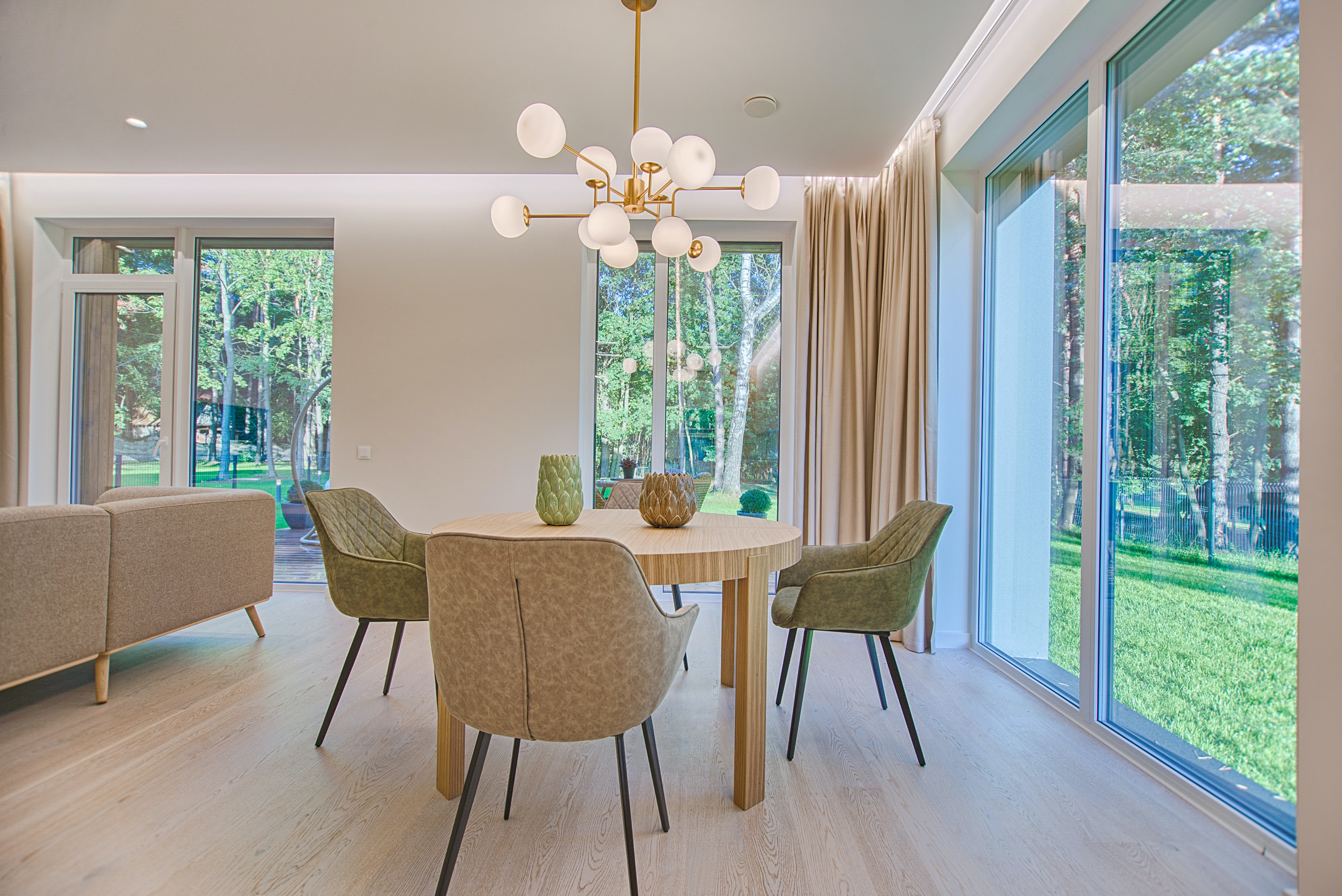
In a dining room, there’s a recommendation for at least 48 inches between each edge of the table and the nearest wall or piece of furniture. This is to give space to move around easily.
In bedrooms, the recommendation is at least 24 inches between the side of the bed and a wall, and at least 36 inches between the bed and a swinging door.
10. Do some Planning
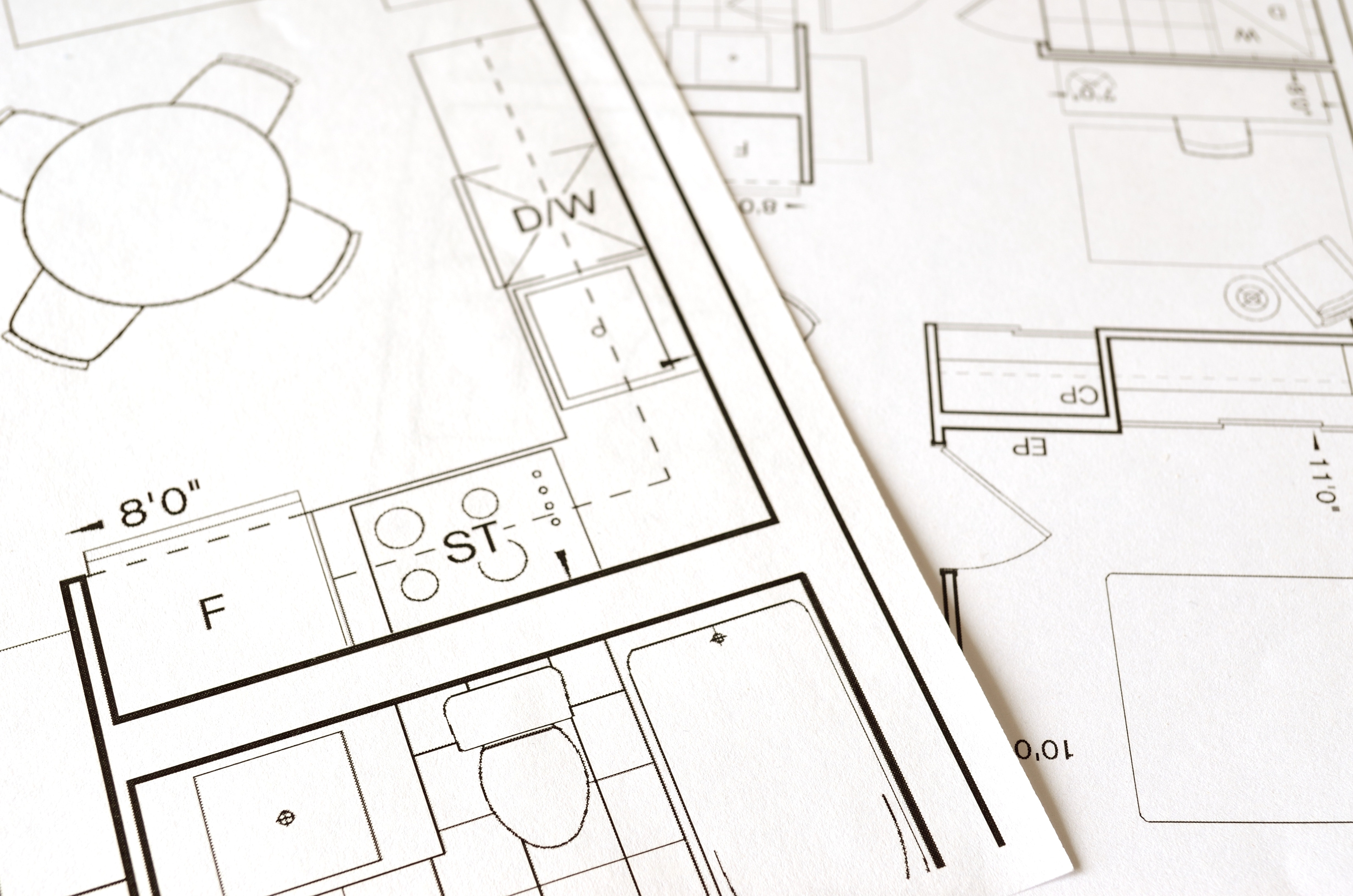
Before you move furniture test your design thought on paper. Measure the room’s dimensions, making sure your noting the location of windows, doors, heat registers and electrical outlets. You can use graph paper or use a digital room planner to test various furniture. This process can be fun!
Of course these are all just suggestions and the exact measurements on spacing furniture out can be adjusted to fit your needs. Just have fun with it and remember you can always change it.
Written by Chasity Rodriguez
Social Media Director
Windermere Mill Creek Real Estate

 Facebook
 X
X
 Pinterest
 Copy Link
